
Six principles that separate a chart people read from a chart people squint at, with the before-and-after evidence for each.
A chart in a board pack has a harder job than a chart in an analysis notebook. Nobody in the room built it, nobody has seen the data behind it, and the attention it gets before someone decides whether to engage is measured in single-digit seconds. Everything below follows from that one fact.
What a business audience needs from a chart
A notebook chart has a patient, informed audience: the person who made it. A board-pack chart has none of those luxuries. In a live meeting it is worse still, the audience cannot pause to study the slide, because the presenter is talking straight over it.
So the standard is unforgiving. Before it earns a second look, a business chart has to land on a question the reader is already carrying, deliver its point without sending anyone hunting through a legend, and hold up whether it is beamed onto a wall, run off a greyscale printer, or clipped into an email thread. Every principle that follows is simply a consequence of clearing that bar.
One chart, one message
The usual way business charts go wrong is not ugliness, it is overload. Pile revenue, margin, headcount and growth onto a pair of axes and you have not drawn a chart; you have drawn a table and hidden the numbers inside it. The reader is left to guess which of the four things you care about, and most will not bother guessing.
Settle the single takeaway before you open the tool, then hand it to the reader in the title. “Revenue by region” only labels the axes. “Online passed East to become our biggest channel this year” tells the reader what to conclude, which is the whole job.
✕ Avoid Four series on two axes, a title that only names the variables, and a legend to decode the whole thing. | ✓ Prefer One series, or one highlighted against a grey background, under a title that states the finding as a sentence. |
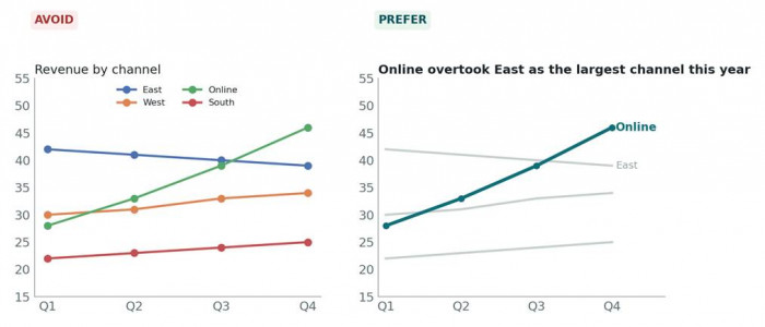
The same four channels. Left: four series and a legend to decode. Right: one line highlighted, the finding in the title.
If the data has two findings, make two charts. Slides are free.
Choose the chart by the question
Choose the chart from what the reader is trying to find out, not from whatever looks the most sophisticated. The lookup is short enough to keep in your head:
| The reader wants to know… | Reach for | What people grab instead |
| Which one is biggest? | A sorted bar chart | A pie, slices are hard to compare |
| How has it moved over time? | A line chart | A forest of skinny vertical bars |
| How is the whole split up? | A stacked bar, or a donut of ≤5 parts | A ten-slice pie with a legend |
| How do two groups compare across categories? | A grouped bar chart | Two pies side by side |
| Does one thing track another? | A scatter plot | A twin-axis line chart, scales clashing |
| What is the precise figure? | A table, not a chart | A chart labelled to two decimals |
Table 1, Chart type, chosen by the reader's question.
The row people skip most often is the last one. When a decision hinges on exact numbers, a clean table beats any chart, visuals are for shape and comparison, not for reading precise values off a page.
Use colour to direct attention
Colour is the quickest signal a chart owns, and most business charts fritter it away. Six categories in six colours quietly tells the reader that all six deserve equal weight, a message you almost never mean to send. It also collapses in greyscale and locks out anyone with a colour-vision deficiency.
The rule that holds up: one series, one colour. If the story is a single category, paint that one and drop the rest to grey. If it is two series against each other, pick two colours that differ in brightness as well as hue, so the contrast survives a black-and-white print. And keep red for genuinely bad news, a red bar that just happens to be category four whispers a warning you never intended.
✕ Avoid Default palettes, rainbow sequences, red or green used with no meaning, and colour as the only way to tell series apart. | ✓ Prefer Grey for context, one accent for the point, a second accent only for a second series, and direct labels so colour is never the sole cue. |
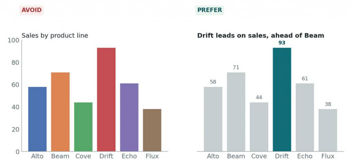
Same data. On the right, colour does one job, it points at the finding, and the values are labelled directly.
Label directly and remove chart junk
A legend makes the reader bounce: read the chart, jump to the legend, match the colour, jump back. Direct labels delete the round trip, drop the series name at the end of its line, the value at the end of its bar. Whatever the reader needs should already be sitting under their gaze.
Then strip out everything that is not pulling weight: gridlines heavier than the data, a thick chart border, 3-D extrusions, drop shadows, exploded pie wedges, tick marks every five units. All of it is decoration, none of it helps anyone compare values, and each piece elbows the data for attention.
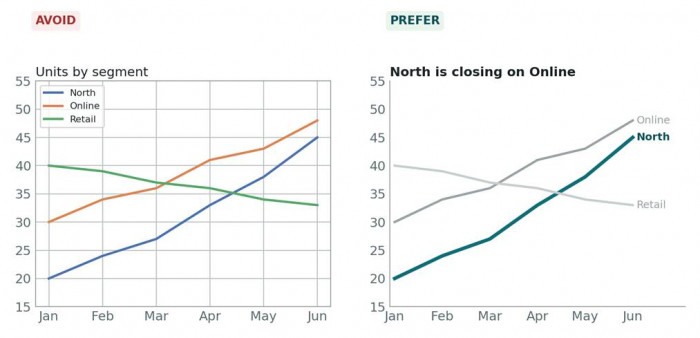
Left: the reader decodes a legend through heavy gridlines and a border. Right: the answer sits at the end of each line.
↳ A useful test: pull an element out and check whether the chart got harder to read. If nothing was lost, leave it out for good.
Keep scales honest
Bars turn value into length, so a bar axis that starts anywhere but zero tells a lie. Draw a climb from 92 to 97 on an axis beginning at 90 and it reads like the number tripled. Put that in front of a board and someone will call it out, and they will be right to.
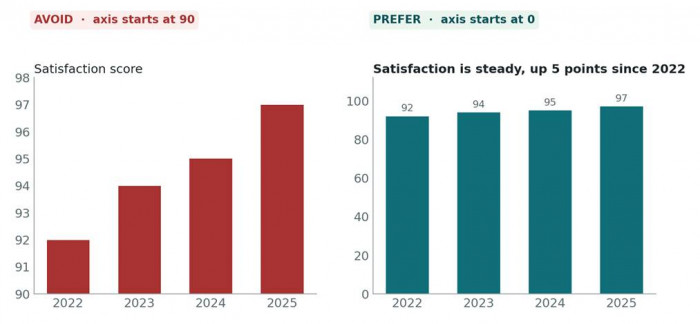
The same four numbers. The left chart is technically labelled and still misleading; the right one starts at zero.
Bars begin at zero, always. Lines needn't, but must admit where they start.
Lines play by different rules: a line turns value into position, so a cropped axis is fine when the movement itself is the point, provided you label it plainly. Two habits ride along, hold the scale steady across any charts meant to be compared side by side, and never rig a dual axis to fake a correlation between two unrelated lines. If two things genuinely belong together, show them as two small charts sharing one x-axis.
Stay consistent across the whole document
Twelve charts in twelve styles read as twelve documents stapled together. Consistency is what turns a deck into a single argument instead of a pile of exhibits, and it speeds every chart up, because the reader learns your conventions once and then coasts.
Lock these down once and repeat them everywhere: the palette (grey plus one or two accents), the typeface and its sizes, where titles sit and how they look, how axes are handled, and the units. If more than one person touches the document, write it all onto a single-page chart style sheet and hold everyone to it.
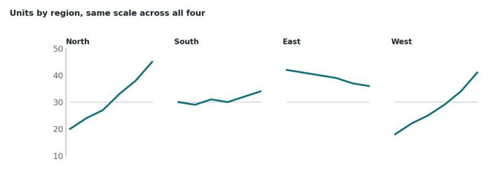
Small multiples: one style, one scale, four regions. The reader compares shapes without re-learning anything.
Report charts vs presentation charts
A written report and a live talk are consumed under completely different conditions, and a chart tuned for one usually falls apart in the other. Worth laying the differences out flatly:
| Where it lands | In a written report | On a live slide |
| Time to read | As long as they like; they can flip back | A few seconds, over someone's voice |
| Level of detail | The lot: gridlines, notes, footnotes, source | Bare minimum: one line, two labels, one point |
| Text size | Body size, matched to the page | Big enough for the back row |
| Number of series | Several are fine if labelled | One highlighted; the rest greyed or gone |
| Title | Descriptive, finding in the caption | The finding is the title |
| Colour | Must survive a greyscale printer | Must survive a washed-out projector |
| Export format | PDF or SVG for print-sharp lines | SVG; PNG at 2× only if SVG won't import |
| Source note | Always, footnoted beneath | Small in a corner, or in speaker notes |
Table 2, How the same chart changes between a report and a slide.
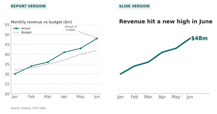
One dataset, two destinations. The slide version drops everything the presenter will say out loud.
The takeaway is blunt: do not paste a report chart onto a slide. Rebuild it for the room, or keep both versions going from the start.
Tools that build good practice in
Every principle above can be pulled off by hand in Excel or Google Sheets. The catch is doing it on every chart, every time, with a deadline breathing down your neck. The three tools below each take some of that load off, in different ways, listed from most manual control to least.
Datawrapper
A browser tool for charts, tables and maps, raised in newsrooms where an editor signs off before anything ships.
● Enforces, tidy typographic defaults, sane gridlines, line-end labelling, labels that don't collide, and a description-and-source field beneath every chart.
● Leaves to you, chart type, sort order, colours, the title. It won't talk you out of a ten-slice pie.
● Output, responsive web embed; PNG on the free plan; SVG and PDF on paid tiers; branded themes are paid.
● Best for, report charts that live online or get refreshed over time.
Flourish Studio
A template-driven tool, now part of Canva. Its calling cards are motion and interactivity, bar-chart races, animated transitions, scroll-driven stories.
● Enforces, consistent styling inside a template and across projects that share one, responsive layouts, clean axis and label defaults.
● Leaves to you, restraint. So many templates and knobs that piling on motion a business crowd doesn't need becomes the easy path.
● Output, web embed on every plan; image and SVG on the Presenter plan; drops straight into Canva decks.
● Best for, Canva-built decks, and the rare chart where animation genuinely carries the point.
ChartGPT.CO
A browser chart maker that produces a chart from pasted spreadsheet data or a plain sentence describing the numbers, nine static types, no editor.
● Enforces, bars always rooted at zero (ask for a narrow range and it returns a line chart instead); one colour per series with the rest greyed when a bar is highlighted; sorted rankings; a title written as the finding once you say what the chart is for; and a flag when the data is ambiguous rather than a silent guess.
● Leaves to you, the message. It draws whatever you describe; it cannot know which of two findings the board cares about.
● Limits, colours and axis range are locked, and nothing survives between sessions, so keep the source range and prompt somewhere else.
● Best for, static slide charts made fast and uniform from mixed sources.
Manual charting vs Datawrapper, Flourish, and ChartGPT
“By hand” means a chart built and formatted by hand in Excel or Google Sheets.
| Principle | By hand | Datawrapper | Flourish | ChartGPT |
| One chart, one message | Your discipline; defaults invite extra series | Your call; the description field nudges a finding | Your call; templates invite richness | Prompted, the title states the finding you describe |
| Chart by question | Gallery pick, no guidance | Gallery pick with a note per type | Suggests a template from the data | Reads the data shape, or takes the type you name |
| Colour directs attention | Every series coloured; fixed by hand | Good defaults; highlight set by hand | Template palette; highlight set by hand | Automatic: one accent, rest grey; not adjustable |
| Direct labels, no junk | Legend by default; junk cleared by hand | Direct line labels, clean defaults | Clean defaults; extras easy to add | Direct labels, minimal chrome by default |
| Honest scales | Auto-scales; bars often start above zero | Zero baseline default; can change | Zero baseline default; can change | Enforced for bars; can't be changed |
| Consistency across a deck | Repeated manual formatting | Saved theme on paid plans | Reuse one template and settings | Built in; every chart shares a look |
| Manual control | Complete | High | High | Low |
| Best fit | Charts that live in the workbook | Web reports updated over time | Canva decks, animated stories | Static slides, fast and uniform |
Table 3, Each approach against the six principles.
Read down the columns and the trade-off is plain. Doing it by hand can satisfy every principle but leans entirely on you remembering each one on every chart. Datawrapper and Flourish handle labelling and defaults well and leave the judgement calls to you. ChartGPT.co enforces the most automatically and, in return, gives you the least room to override it.
Why prompts matter when creating AI-generated charts
AI can create a chart in seconds, but the quality of the result depends heavily on how clearly the request is written. A vague prompt like “make a sales chart” leaves too many decisions open, from choosing the chart type to deciding what insight should stand out. A well-structured prompt can guide the AI on the audience, purpose, data relationship, preferred visualization style, key takeaway, colours, labels, and formatting requirements. The better the instructions, the more likely the final chart will communicate the intended message instead of simply displaying data. In practice, prompting AI for charts works like briefing a designer: the clearer the goal and context, the closer the output will be to a chart that people can understand quickly and act on.
Conclusion
Good business charts are not a gift of design talent. They are what you get from a handful of principles followed without fail: one point per chart, the type set by the question, colour spent only to direct the eye, labels where the reader is already looking, scales that don't cheat, and a single style across the whole document. Whether a chart gets read or gets skipped almost always comes down to those six.
Apply them by hand if you have the time and the discipline. Where you don't, pick the tool that covers the ones you tend to drop, Datawrapper for web reports, Flourish for Canva decks, ChartGPT for static slides where speed and sameness matter more than fine control. Then apply the six, every chart, no exceptions.










Comments